This has been such a wonderful first semester in the design program. I am so thankful for this class experience with each and every one of you and our teacher/friend, Austin! I am looking forward to spending these next years in Design among this group of creative people! Thanks ever so and have the Merriest Christmas!!!
Wednesday, December 18, 2013
Tuesday, December 17, 2013
Layouts for KAKA Compact
KAKA promises an aesthetic and unobtrusive product for our insanely cool customers. We have included oil-removing-wipes, several mirrors, and an easier-to-hold applicator to keep our customers happy and looking be-yoo-ti-ful. Not only is this product useful, but it is also triangular. How many triangular foundation compacts have you seen before? Thas right, NONE. Nothing competes with the KAKA compact. Don’t agree? Let us know, we have a money back guarantee!
Thursday, December 5, 2013
Friday, November 22, 2013
Final Accordion Book
I chose the envelope design because I loved the interactive aspect of it. I designed it so that the audience will observe the process of the project through photos. When they view it they will see the constructing process first, on the outside of the envelopes. Then they will untie the ribbon to view the word in its' environment. I created a postcard affect layout to make it interactive and to add an element of surprise.
Constructed Word Reflection
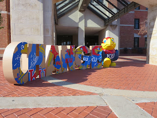
CHANGE. We constructed our word in all CAPS to convey a bold impression when one viewed our letters. We also chose to employ all CAPS because then we could easily fit a readable Jayhawk on each letter to make it identifiable with people. We formed our letters by tracing them onto a piece of cardboard during class, and creating a painting number diagram so we could easily go back and paint them without second guessing the colors. Painting took some time, at least two hours per a letter but I believe it was worth it in the long run because it makes them appear professional and presentable. Lastly, we assembled the letters with a glue gun after carefully measuring out dimensions for the siding of the letters.
Our initial idea for the placement of our word was the back entrance to Strong Hall because of the beautiful architecture and the engraving of THE UNIVERSITY OF KANSAS looming above the balcony that we placed the letters on. This location captured a great shot but we wanted to place the word on several locations, to communicate the diverse definition of change. For instance we placed the word in front of the campanile because this initiates the idea of a change in time but also one’s lifestyle. It announces the time every quarter of an hour but this is also the place where one graduates, you enter the campanile as a college student and then exit it as a graduate. The final location we chose was in front of the union near the Jayhawk statue. We chose this location because it literally shows the beginning of the Jayhawk and then ends with the most recent Jayhawk, the statue.
Tuesday, November 12, 2013
Photography Composition
The digital camera has not only altered
creativity but it has created a recording method that one can instantly access and
obtain the product. There are several
components to an images composition that ultimately provide the best result:
Symmetry, Repetition, Framing, Close-Ups, Movement, Continuous Mode and
Exploration. All these elements provide a fundamental visual arrangement that
comes across as pleasing to the observer.
This quick guideline on how to accomplish
an aesthetically pleasing photo is extremely useful. I had taken several
photography classes during high school that focused on the benefits of these
compositions and how to master these arrangements. This article is a friendly
reminder to me to focus once again on the arrangement of a photo. It highlights
how important it is to think about your photo before taking it because having a
plan of execution will give one the best results possible. I look forward to
employing these techniques to our project and my future photography photos.
Framing
Friday, November 1, 2013
Documentary Photography
In this article, one is
intorduced to the evolution of photography, but more specifically; this article
focuses on the difference between document and picture photography. Steve Edwards believes that the idea of documenting
versus pictures began in Northern Europe toward the beginning of the
Renaissance, later developping even more at the opening of L’Academie Francaise
and the English Academy. Photographic documents were thought upon differently
based on the people and perhaps one’s occupation, but many believed it was a
success due to the exact documentation of details and the small amount of time
it took to produce an image. Based on
the time, document photography carried a different meaning or had a different
prupose. For example, between the two World Wars the documenting photographs were considered
symbolic to poems. However, throughout the years documentary photos have been
critisized but there still remain several agencies committed to this type of documentation.
This article is very interesting,
I personally have always been intrigued by photographs that document the
history of the world. I have always viewed photography as documenting the
special moments in one’s life, leaving behind something for younger generations
to grasp onto, but this type of documentation is more specific. This records
certain struggles and victories with the hope of passing on knowledge and
lessons to others. The
photographer attempts to produce truthful, objective, and usually candid photography of a
particular subject, most often pictures of people.
Parts of a Letter
In
Parts of a Letter, one is introduced
to the many components of letters or typography. Typography is the style and
appearance of printed matter and the art or procedure of arranging type or
processing data and printing from it. Each letter began with its’ very own
mark, but by adding certain unique aspects to a letter; it becomes unique to
all letterforms. The most common typography is built from the serif and sans
serif composition. Each letter has its’ very own composition and a precise
formation of the letter. For instance, a common trait for all letters is the
baseline but the type of letter, lower or caps determine the height of these. Based on the many components of letters and the several hundred fonts, there is a huge variety of how these components are executed to form and evolve into a new fonts.
I found this reading very relatable to our current project and I am now curious to review the FUTURA font in detail to see if it contains these many aspects. I have always loved looking at the many fonts, but I never actually took into account the formation and unique aspects of each font. This reading has been very informant and will allow me to really consider and contemplate fonts for posters in the near future.
Wednesday, October 30, 2013
CONQUER TOP TEN
‘Conquer’
Verb
•
overcome and take control of (a place or people) by use of
military force throughout a military campaign, war, or simply by chance.
•
successfully overcome (a problem, weakness, or habit.)
•
climb and conquer (a mountain) successfully.
• gain the love, admiration of (a person or
group of people.)
Came from
Old French conquerre.
Subscribe to:
Comments (Atom)


