
Tuesday, April 22, 2014
Alexey Brodovitch

Alexey
Brodovitch (1898-1971) was born in Ogolitchi, Russia to an aristocratic
family. His father was a respected
doctor, providing his services to many humanitarian causes. During Brodovitch’s
younger years, his family sent him to the Prince Tenisheff School with the
hopes of him later enrolling at the Imperial Art Academy. However, Brodovitch
abandoned his studies and ran away to join the Russian Army when World War I
erupted. While attending a Military Academy, the Russian Revolution unfolded
and Brodovitch became a white loyalist – loyal to the Czar. After unfortunate losses and failed attempts
to fight off the Reds, Brodovitch was exiled to Paris where his true existence as
an artist would begin. During Brodovitch’s years in Paris, he was exposed to new
aspects of life: a life of poverty and life as an artist. It was this
combination that allowed the young man to succeed, becoming one of the world’s
most influential graphic designers.
Brodovitch was introduced
to the avant-garde movement while working in Paris. Influenced by the
aforementioned movement, he embraced and evolved his own stylistic features,
which inspired the work he created in the United States. As Andy Grundberg
states, “He played a crucial role in introducing into the United States a
radically simplified, ‘modern’ graphic design style forged in Europe in the
1920s from an amalgam of vanguard movements in art and design.” This new approach was seen through his unique
way of teaching design studios in New York before Carmel Snow, editor of Harper’s
Bazaar magazine, hired Brodovitch
to invigorate the magazine with a modern spirit. It was at Harper’s Bazaar that Brodovitch would imprint the world with his
gift.
Brodovitch
departed from the static layouts and traditionally posed studio photographs
prevalent in 1930s editorial design. Instead, he emphasized the double-page
spread as a dynamic field upon which exquisite photographs, crisp Bodoni
typefaces, and elegant white space were arranged into a total composition. Margarete
Gross explains, “The double-page spread was one of his signature innovations,
as was the emphasis on negative space in layouts.” By the 1950's, white space
was the hallmark of the Brodovitch style. Models “floated” on the page, encompassed
in a sea of whiteness, while headlines and type took on an ethereal presence.
Brodovitch was able to create an illusion of elegance from the mere hint of
materiality. Clothes were presented not as pieces of fabric cut in singular
ways, but as signs of a fashionable life.
Brodovitch’s
layouts remain models of graphic intelligence and inspiration, even if seldom
imitated, and the artists, photographers and designers whose careers he
influenced continue to shape graphic design in the image of his uncompromising
ideals.


Sunday, April 6, 2014
Monoprint Collage

* This was created through layering several different monoprints through photoshop.
Terrence Malick: The Tree of Life

I have grown to love Malick's poetical captivation and framing of beauty. His work has caused me to observe and enjoy life to the fullest. But also, it encourages and motivates me to create moments of simple beauty into art, just like this poster.
Invisible Art/Visible Artists


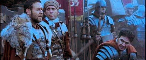


In Allan Holzman’s documentary: Invisible Art/Visible Artists, one is allowed to travel into the world of famous Hollywood editors as they describe their methods and mapping process of editing. As seen in the documentary, there are several ways to approach and accomplish editing in order to maintain continuity within a film and to accurately portray the emotions of shots, scenes, and sequences. One editor that I have admired is Pietro Scalia.
Scalia has accomplished much in his Hollywood career, working on a variety of films and employing different editing techniques along the way. In this documentary, he discusses his tackling of the opening scene of Ridley Scott’s Gladiator. He explains that he montaged this opening scene by carefully regarding each shot, but the key factor to accomplishing this scene was achieving its historical context. Scalia secured the context by montaging the scene with multiple music compositions that reminded him of the Roman culture. Although this was not Hans Zimmer’s score, Pietro Scalia was still able to create a masterpiece that truly draws the viewer into the battle with Russell Crowe’s character Maximus. I was thoroughly impressed when Scalia explained this process. The rhythm and beat of the scene is so perfect, and to mold it with music that would not be utilized at all seems rather risky. This method obviously inspires him during the working process and I would be interested to see if he applies this concept to his other movies.
I really enjoyed having Alan Holzman come and present his work to our class. It was informative and educational; it was especially nice to see all his work. This lecture has sparked an interest in me to look more into the editing process and perhaps experiment with it one day.


Subscribe to:
Comments (Atom)