Sunday, February 16, 2014

Scouting Locations


The Midwest. This photo collage would center on either this scenic farm or it will focus individually on the windmill. The farm scene would capture different times of the day, while the windmill photo would be at a certain angle capturing the movement and change in wind; as well as the different hours of the day.


In this photo collage, documenting of time would occur through different day shots of the location beginning from dawn and ending at sundown. This location has a natural framing that leads the viewer’s eye to the main subject, my brother. Still brainstorming for a theme/story within the photograph. 


Running from the Past. This photo collage would feature my younger brother, Brendan as a young man running from his past, seeking a new future. This isolated landscape/space would be ideal because it could be placed in any historical context. The photo collage would capture time by alternating the times of days between night and sunrise/sunset.

This idea originally came to me when I read a John Wayne quote: “Nothing beats a Kansas sunset.” The silhouette of the trees will create a beautiful, breathtaking photograph that will communicate the story of this young man yearning for the dawn.


Vanity. This photo collage would feature a girl preparing for the day by applying makeup. Time will be documented by illustrating the changing appearance of the girl with/without makeup. This will all occur at a morning vanity.


Wednesday, February 12, 2014

Final Solution

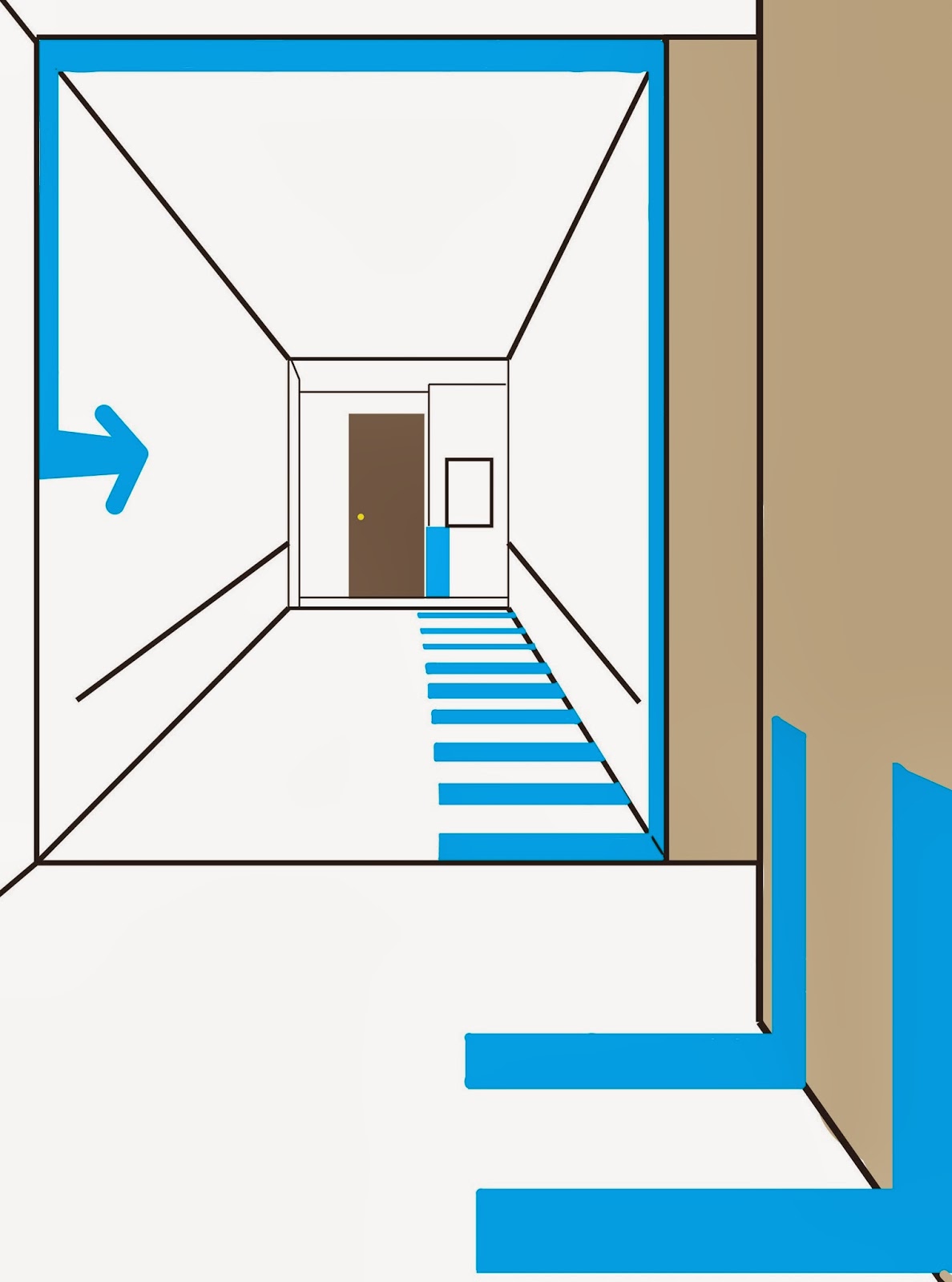
For our final wayfinding solution, the group decided to eliminate the blue-striped path altogether because it was overwhelming for the users and it was obtrusive to the environment. We replaced the blue-striped path with arrows that are incorporated into the architecture of the buildings. We added several new aspects to our design.
  1. First, we involved the handicap icon at the beginning, middle, and end of the path. This icon appears to show one's progression through the path, but also add an element of fun for the user.
  2. The elevator has a sticker indication, telling one, which levels the handicap accessible bathrooms, is located.
  3. We lowered the nodes with icons, so that it would be at our user's eye-level. 
  4. Lastly, we made certain that each arrow indicated the correct direction, while also directing visibly to the next arrow. This allows the path to be continuous but not overwhelming. 


Revised Solution

 In this revised solution, we decided to add consistent arrows within the striped path. This was to break the consistency of the path and add excitement to the experience.


Testing Results

Purpose of Test: Discover if the improved wayfinding methods make the route easier for any user. 

Results: Tester #1 went along the blue-striped paper path. The Tester was able to successfully navigate his way from and out of the two entrances located in Marvin and the Art and Design building. Trying to find elevators to access different levels of each building was easy and incredibly helpful due to the wayfinding techniques employed by the group. Tester felt overwhelmed by the amount of blue that covered the building, and thought that the amount of paper on the walls is unnecessary. Otherwise, the Tester was happy with how the path was organized.

Tester #2 knew nothing about either building, so he had no experience navigating himself through the unlabeled levels of Art&Design or Marvin Hall. Beginning at the accessible handicap entrance, he could easily direct himself to Marvin Hall offices due to the wayfinding path and techniques performed by our group. The user found the path to be very creative and enjoyable to navigate, but he thought the path was too consistent and straightforward. Tester #2 suggested adding an inconsistency to the path or breaking the pattern to succeed in getting the ultimate experience.