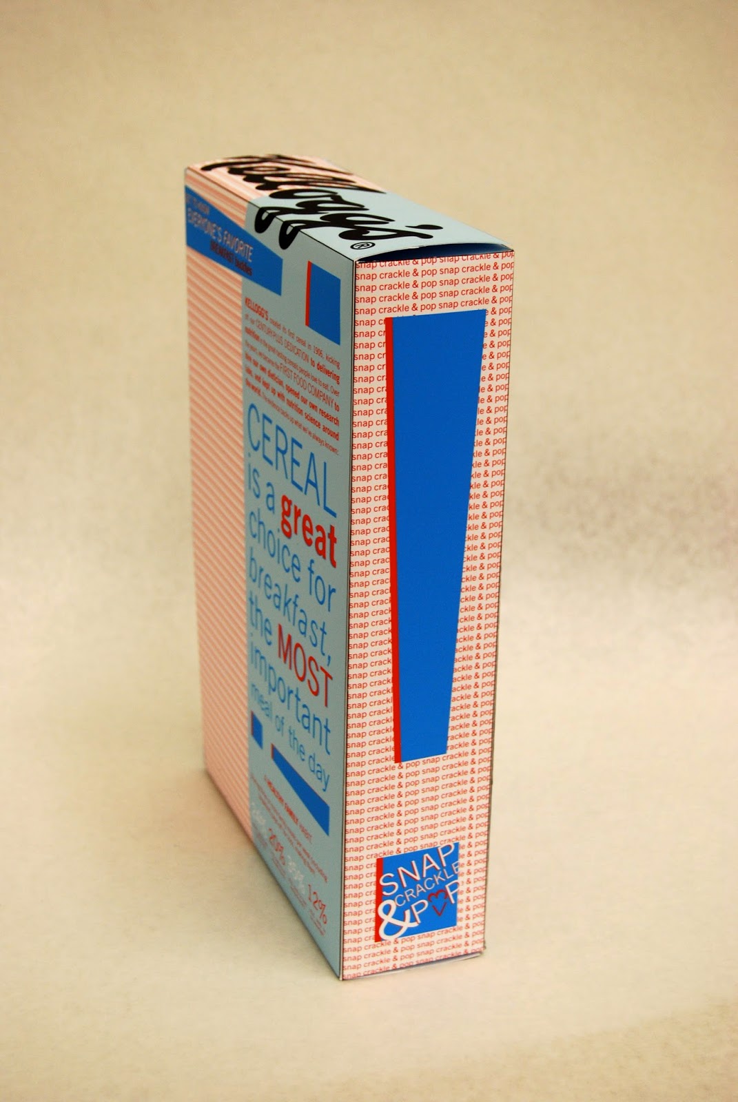
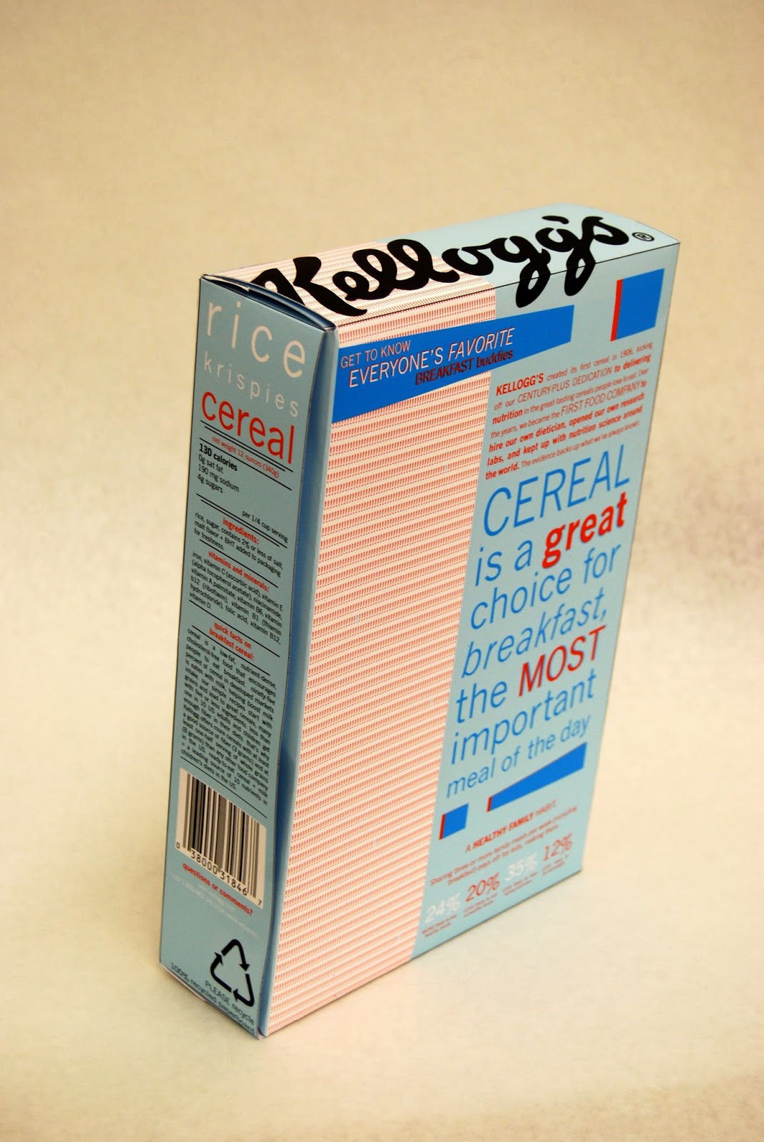
Fini. For the first project, the class was assigned to redesign a Rice Krispies cereal box. The main task was to consider the form and typography on a 3-Dimensional surface.
Each Design below is influenced by an attribute, which conveys the overall tone of each design. From left to right:
1) Comfort 2) Energy +Informational 3) Refined + Order
I decided to propose the third box as my final design. This box is a result of the 'Game of Chance' trials, which had enjoyable and inviting results. With the results as a guideline, I created this design. The amount of white space gives the design a minimalist tone, evoking sophistication and order. But the true jewel of this design is the barcode. The barcode was the main building block for this design, allowing the provided text to be placed in an orderly fashion.
This was a very enjoyable project. I was truly able to explore with the provided text and try several different formats. Great way to start off the semester:)

 This is my second exhibition mockup, but I realize that there is still a lot of work to be done. Specifically, I would like to make the exhibition more dimensional, so perhaps I could play with the floor and walls. Other than that, I am happy with the overall layout of the exhibition. At the far end of the shipping container, there is a good amount of wall space for Charlie Parker. This wall space is meant to represent the potential feeling of freedom Parker's music offers. He was called 'the bird' because when he played, his soul was as free as a bird. I wish for viewers to feel at peace in this area, relaxing while listening to some of his best bebop songs. The outer area is meant to focus more on bebop movement as an art.


