
Saturday, October 25, 2014
History of Typography
After watching this video for the fourth time, I have learned the history of typography. Before watching this, I understood the basics of typography: Roman, Old Style, Transitional, and Modern. I must say that I was extremely rusty on the Sans Serif time period. I find it fascinating that Caslon's grandson was the created and instigator of sans serif fonts. I would really like to spend more time in the future studying sans serif fonts more thoroughly, for I feel I tend to stick to the more traditional and classic fonts.
FUSE Designers
Neville Brody describes the purpose of FUSE Design; they are interested in exploring form and pushing the edges of language through their employment and creation of typography. It is essential to consider function and form, form will always follow function because one must dictate what the function is before deciding on the form. Fellow designers that have aided Brody in this pursuit are Phil Bicker, Mario Beeraert, John Critchley, David Crow, Tobias Frere-Jones, and Cornel Windlin.
Phil Bicker is an internationally known photo editor, creative art director, and designer. Bicker began interested in fashion when he was attending college, causing him to transfer to London College of Printing. After College Bicker was able to find small jobs that allowed him to build his name and portfolio. Bicker has worked as the photo editor of TIME magazine but he was also art director for Neville Brody’s magazine THE FACE.


John Critchley is a famous typeface designer who graduated from Manchester Polytechnic. Soon after, he joined Neville Brody’s London studio where he co-edited FUSE. FUSE is a collection of experimental typefaces and posters. Since then he has worked many jobs, including a position as Art Director for MTV.


David Crow was born in Galashiels, Scotland in 1962. He studied Graphic Design in Manchester before moving to London to find a stable job. He later returned to education, teaching graphic design in Salford and Liverpool. He is currently the Head of School of Design at Manchester Metropolitan University. He is well known for his work in mechanical notation of visual language.


Phil Bicker is an internationally known photo editor, creative art director, and designer. Bicker began interested in fashion when he was attending college, causing him to transfer to London College of Printing. After College Bicker was able to find small jobs that allowed him to build his name and portfolio. Bicker has worked as the photo editor of TIME magazine but he was also art director for Neville Brody’s magazine THE FACE.
http://www.linkedin.com/pub/phil-bicker/4/813/2b0
Mario Beernaert is a Belgian designer who studied at St. Lucas University. He has worked for FontShop, FUSE, and many other projects. He is a free lance designer, picking up fun projects that allow him to express his interpretation of design.
http://be.linkedin.com/in/mariobeernaert
http://www.identifont.com/show?154
David Crow was born in Galashiels, Scotland in 1962. He studied Graphic Design in Manchester before moving to London to find a stable job. He later returned to education, teaching graphic design in Salford and Liverpool. He is currently the Head of School of Design at Manchester Metropolitan University. He is well known for his work in mechanical notation of visual language.
http://www.art.mmu.ac.uk/profile/dcrow
Tobias Frere-Jones was born into a family of artists. He began displaying his artwork in New York Galleries at quite a young age. He studied at the Rhode Island School of Design, later graduating and beginning to work full time at Font Bureau. Since then he has pursued many avenues of design. In 2013, he was rewarded with the AIGA Meadl for exceptional achievements in the design field.
http://www.fontbureau.com/people/TobiasFrereJones/
After graduating from Schule fur Gestaltung Luzern, Cornel Windlin moved to London to work with Neville Brody on THE FACE magazine. He later returned to Switzerland to start his own design firm. His work has won critical acclaim throughout the years especially his formation of the digital font foundry Lineto.
http://www.artifiche.com/cms/front_content.php?idcat=6&ar=872&v=d&lang=2
Wednesday, October 22, 2014
Brief Lesson in Typography Continued...
Small caps are capital or uppercase letters that are a smaller size than regular capitals in a given font. They are about the size of normal lowercase letters, opposed to matching in scale with ALL CAPS. Small caps allow the font to be more readable, it is less harsh than ALL CAPS, balancing out the composition.
Examples:


*Baskerville does have small caps.
Ligatures are two or more letters combined into one character. These are often employed to emphasize sounds letters create, but the most important function is to improve the appearance of the font. The ligature creates a smoother transition or connection between characters by connecting crossbars, removing dots over the i, or otherwise altering the shape of the characters. Some common ligatures are: fi, ff, or fl.
Example:

*Baskerville does have ligatures.
The difference between apostrophes and footmarks is their purpose in grammar. Apostrophe are utilized for quotations and references while footmarks are employed to list measurements. Inch marks and quotation marks fall into this same category. The rounder the mark will go in the quotation category while straight lines go with prime marks.

A hyphen is a punctuation mark used to divide or compound words. While an em-dash is punctuation used to note a pause in thought–just like this. Similar to the em-dash is the en-dash, and this punctuation is a substation for the word "to."

Wednesday, October 15, 2014
Brief Typography Lesson
Old Style is a style of serif font developed by Renaissance typographers to replace the Blackletter style of type.
Ex: Centaur, Garamond, Goudy Old Style, etc.

The Antiqua of type of the 16th and 17th centuries evolved into a serif typestyle known as Transitional.
Ex: Baskerville, Times New Roman, Perpetua, etc.

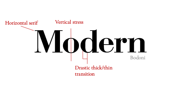
Modern is a style of typeface developed in the late 18th century that continued through much of the 19th century.
Ex: Bodoni, Didot, Century Schoolbook, et.
A Slab Serif is a type of serif font that evolved from the Modern style. The serifs are square and larger, bolder than serifs of previous typestyles.
Ex: Rockwell, Rider, American Typewriter, etc.

Type which does not have serifs — the little extra strokes found at the end of main vertical and horizontal strokes of some letterforms — are called sans serif (without serif).
Ex: Arial, Helvetica, Futura, etc.

Stroke weight is the main diagonal portion of a letterform or other parts of the letter such as: bars, arms, stems, and bowls. These are collectively referred to as the strokes that make up the letterform. Weight determines the thickness of a stroke.
An imaginary line drawn from top to bottom of a glyph bisecting the upper and lower strokes is the axis. While stress is the direction, in which the curve stroke changes.
Small caps are uppercase characters set at the same height and weights lowercase letters or text figures.
Lining figures are a modern style of numerals where all figures are of the same height and rest on the baseline while non-aligning figures are numbers that don’t line up on the baseline.
Two or more letters combined into one character make a ligature.
Two relevant type measurements include width and depth measured in points.
Sunday, October 12, 2014
Baskerville

Serif
John Baskerville
1754
Classified as Transitional
Regular/ Italic/ Medium/ Medium Italic/ Bold
Saturday, October 11, 2014
Project Summary: Parts Make a Whole
This project was very enjoyable due to its fulfilling result at the end. To begin, the boot camp was the perfect way to introduce this project. It allowed one to explore the unknown, but the essential aspect was the free range. One could pursue an idea or concept without running into a barrier, it was a very open-ended process with a satisfying result at the end.
I really enjoyed how informative this project was as well. There were multiple readings on the blog that were both historically and materialistically interesting and relevant to the project and its’ process. I would have loved to explore this project a little bit more further because there were so many possibilities, and after attending the Hallmark Symposium I think I shall try to further my knowledge in creating new letter forms because it so beautiful and authentic.


Project Two: Modular Typeface
For this project, one begins by drawing the core letters: A, D, H, G, N, O, R, S, and V. These letters would be executed in both, lowercase and uppercase formatting. To begin creating a modular typeface, one would choose a consistent design and employ it to each letter form. Employment of a grid is an excellent way to create a design. Therefore, this project began with a series of exercises involving grids, where one was to form the core letters with the items or formatting material that was provided at class stations. For instance, the paper clip could easily be manipulated into letter forms, but the crucial point is displaying a prominent design throughout the design. A way to accomplish this would be to consider line weight, stress, height, proportion, etc.
Once having created multiple designs, one would choose a modular typeface to pursue. Through several class critiques, this design would be perfected and later developed for use on the computer. Once developed on the computer, one was required to create a FINAL poster and a GIF displaying its’ beautiful form.
Here are some of the initial sketches:
Here are some of the initial sketches:


Un coeur de lion cover

- It may be time to defend something that is dear to your heart - defend it fiercely if you must.

Lion Hugs :)
This was a wonderful stress relief during this project, and the story is absolutely intriguing. Love it a lot, please watch the video!


Friday, October 10, 2014

Project ONE: VISCOM 204
The first project involved designing or branding an animal. The professor provided sixteen categories to base the designs on, these categories included:

- Image.
- Calligraphic lines.
- Gestural drawings.
- Graphical drawings.
- Geometric drawings.
- Collaging.
- Alternative mark making.
- One line drawing expressing your animal's meaning.
- Behavioral.
- Texture.
- Hybrid.
- Marking on a surface.
- Icon.
- Index.
- Abstract.
- Typography.
With these categories, one drew over two-hundred sketches of this particular animal. The process was very extensive, one would draw in sets of ninety-six and then one would narrow it down, making refinements along the way.
Here is a snippet of some sketches, not all are accounted for;)
Subscribe to:
Posts (Atom)