Old Style is a style of serif font developed by Renaissance typographers to replace the Blackletter style of type.
Ex: Centaur, Garamond, Goudy Old Style, etc.

The Antiqua of type of the 16th and 17th centuries evolved into a serif typestyle known as Transitional.
Ex: Baskerville, Times New Roman, Perpetua, etc.

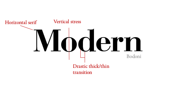
Modern is a style of typeface developed in the late 18th century that continued through much of the 19th century.
Ex: Bodoni, Didot, Century Schoolbook, et.
A Slab Serif is a type of serif font that evolved from the Modern style. The serifs are square and larger, bolder than serifs of previous typestyles.
Ex: Rockwell, Rider, American Typewriter, etc.

Type which does not have serifs — the little extra strokes found at the end of main vertical and horizontal strokes of some letterforms — are called sans serif (without serif).
Ex: Arial, Helvetica, Futura, etc.

Stroke weight is the main diagonal portion of a letterform or other parts of the letter such as: bars, arms, stems, and bowls. These are collectively referred to as the strokes that make up the letterform. Weight determines the thickness of a stroke.
An imaginary line drawn from top to bottom of a glyph bisecting the upper and lower strokes is the axis. While stress is the direction, in which the curve stroke changes.
Small caps are uppercase characters set at the same height and weights lowercase letters or text figures.
Lining figures are a modern style of numerals where all figures are of the same height and rest on the baseline while non-aligning figures are numbers that don’t line up on the baseline.
Two or more letters combined into one character make a ligature.
Two relevant type measurements include width and depth measured in points.
No comments:
Post a Comment